
Designer’s Diary
How does a card game come to life? In this designer’s diary for Crystal Echoes, I share the journey my co-designer Leonardo and I have taken: from the initial idea to the first prototypes, from playtesting to creating the world of Crystalvale. A journey through mechanics, illustrations, and graphic design choices, revealing how our game took shape.
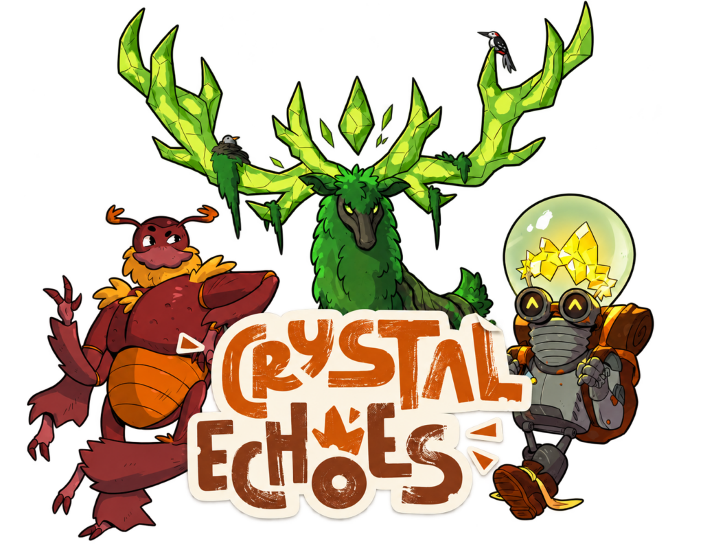
Where It All Began
Crystal Echoes, originally called Fantasy Combo, was born out of a real need. As for me, Angelo, I often play with large groups of friends, often more than eight, and finding the right game is always a challenge: easy to set up, quick to explain, yet offering a satisfying dose of strategy.
Of course, there are board games designed for large groups, but most fall into the party game category: light games involving hidden roles or wordplay that rarely offer a truly engaging challenge. I was looking for something different: a streamlined yet deep experience, accessible but rewarding.
That desire is where it all began. A simple need became the drive to create something of our own.
Of course, none of this would have been possible without my dear friend Leonardo. Like me, he is passionate about board games and had long dreamed of designing one of his own. And so our adventure began.
But Let’s Start with the Basics
The need and the ambition were there. All we needed were the right building blocks to bring our game to life.
The first step was to consider which mechanics could become the heart of the experience. We needed mechanics that were simple, intuitive, and suitable for very large groups, with one essential condition: no downtime between turns.
The first idea came almost immediately. As a big fan of card drafting games, I immediately thought of this mechanic. Drafting creates meaningful interaction between players, even indirectly, keeping the pace brisk without frustrating periods of inactivity.
At that point, the direction was clear: we wanted to create a card game. It was the perfect choice to keep the design simple, easy to produce, and compact to package, with low production costs and an affordable retail price.
So we had:
- the cards
- the drafting
- the player count, which we wanted to reach at least 10
But something was still missing: direct interaction.
We wanted to keep the game from becoming a solitary experience focused solely on individual strategy and managing your own “board”. We wanted a party game with a little extra depth, while still keeping the experience shared and engaging.
As a big fan of Stonemaier games, I have always enjoyed the mechanic at the heart of Between Two Cities and Between Two Castles. It may still be somewhat underused, but I think it is truly brilliant: it creates meaningful interaction with the players sitting next to you, even in large groups.
And that is where we found inspiration for the next step in our journey.
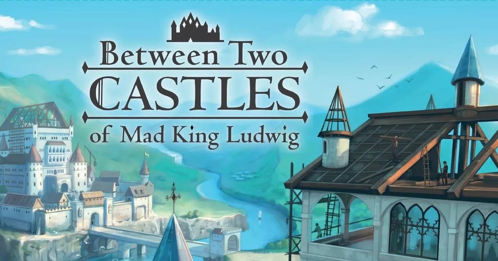
In our case, though, we wanted to avoid a setting that felt too abstract or unengaging, as well as an overly complicated setup. A simple card game—light, portable, and easy to pick up—was the perfect fit.
The core idea was clear: players would work together with their neighbours, to their right and left, to arrange cards in a grid and score as many points as possible based on the final layout. But we wanted to prevent everyone from focusing solely on their own goal. So we introduced an unexpected idea:
- Each player’s final score would be the lower of the scores from the two grids they had helped build.
This simple twist encouraged true cooperation and discouraged selfish behaviour. To win, you had to make sure both grids were strong and well built.
At that point, we needed to decide on the size of the grid. Our first idea was a classic 3×3… but it proved too restrictive. With only 9 cards, the strategic possibilities were limited.
So we quickly moved to a 4×4 grid: 16 cards to place offered plenty of combinations, meaningful choices, and satisfying tactical variety without slowing down the flow of play.
And so, piece by piece, we had laid the foundations of Crystal Echoes:
- A card game
- Easy to explain
- Quick to play
- Fino a 10 giocatori
- No downtime
- Affordable
- With a mix of drafting, cooperation with neighbouring players, and thoughtful interaction
- A scoring system that rewarded balance and collaboration
That was it! We had found our mix: simple, unique, and satisfying. The game we had always wanted for our evenings with friends… we had finally created it.
Getting to Work
First, we needed to put some ideas down on paper.
The game was built around drafting and placing cards in a grid, so each card needed effects tied to its position and proximity to other cards.
One of our first decisions was to divide the cards into families, creating dynamic interactions that made sense within each family and between them. This would allow us to design effects that influenced one another and created strategic combinations within the grid.
But we weren’t just thinking about mechanics: we also kept another key factor firmly in mind, production costs. Not so much for our own sake, but to keep the retail price affordable, allowing the game to reach a wide audience. That’s why we decided to limit the number of illustrations, avoiding too many different cards and aiming for a compact yet rich design.
So we chose to start with four families. Each had unique characteristics, distinctive abilities, and, in some cases, effects that worked in synergy with the other families.
We also introduced multi-family cards: cards that could belong to more than one family at the same time, further expanding the gameplay possibilities.
At this point, we moved on to the most creative phase: designing the cards. As players of games like Magic: The Gathering, Yu-Gi-Oh!, and Flesh and Blood, we decided to do away with any “summoning cost” system. We wanted to keep the game streamlined and intuitive, avoiding overly complex mechanics or anything that would slow down the flow of play.
Each card, therefore, needed to include:
- a base score: always counted, regardless of the context
- an activated ability: whose value depended on its position in the grid and the nearby cards
The ideas kept coming. We explored all kinds of effects, conditions, and combinations until we found a satisfying balance between variety and simplicity.
In the end, each family had six unique characters, including one “special” character—a kind of family leader. Alongside these were the multi-class cards and a wild card, bringing the total to 31 different cards.
The First Steps
At this point, the decisive moment had arrived: getting our hands on the game. We wanted to find out whether the mechanics, effects, and interactions really worked… or whether it was all just a good idea on paper.
To make the experience more tangible and engaging, we decided to give the game a simple, instantly recognisable setting: classic fantasy. Players would work together to build the best possible army in preparation for an impending great war. A straightforward, familiar, yet effective concept.
And so the project got its first name: Fantasy Combo.
“The great war is about to begin. The races of every world are joining forces to raise the most powerful armies in history. Ally with your neighbours and fight for supremacy. Build the strongest army and claim victory.”
For the card families, we drew directly from folklore and fantasy classics to speed up the creative process—especially during prototyping.
Here are the four original races:
- The Empire: the classic human race, inspired by the aesthetic of World of Warcraft. Focused on order and precise placement. Colour: blue.
- Chaos: dark beings such as sorcerers, zombies, and orcs, born of pure Chaos. Focused on disorder and numbers. Colour: red.
- The Beasts: colossal, wild, non-humanoid creatures. Pure brute force, without much fuss. Colour: purple.
- The Sylvans: the strangest and most unpredictable faction. Sprites, unicorns, curious and mysterious creatures, with unusual effects. Colour: green.
These four families provided the foundation for developing unique abilities, interactions, and iconic characters.
The First Cards
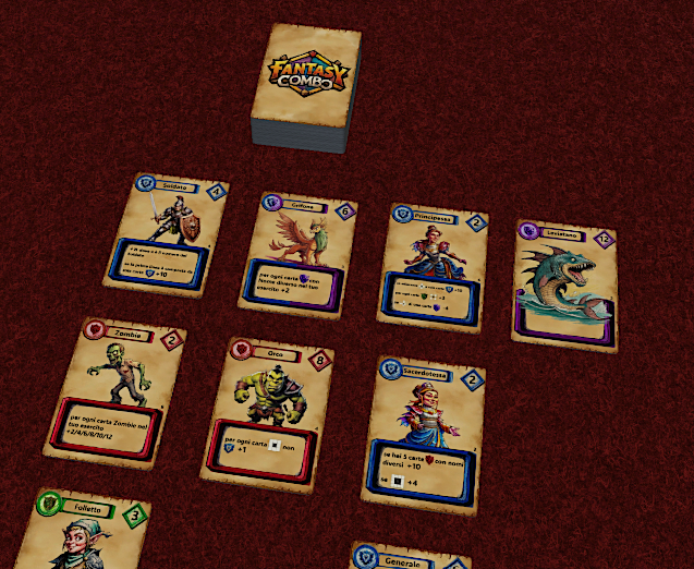
I jumped straight into PowerPoint and started designing the card layout. It needed to be simple, intuitive, and classic.
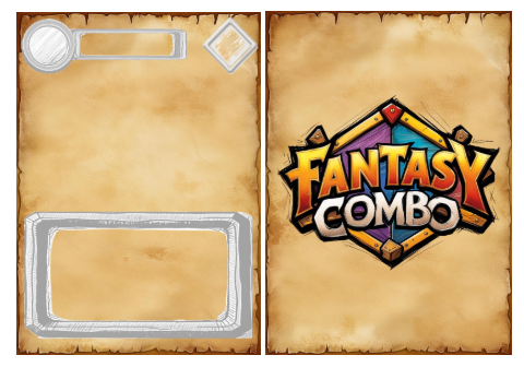
This was the first layout. At the top would be the faction symbol and the character’s name, with their base “Strength” on the right. The character’s image would sit in the centre, with their ability at the bottom.
At this point, I used Canva extensively, particularly its AI tools to generate images for the first characters and put together a beta version of the game with at least some visual appeal.
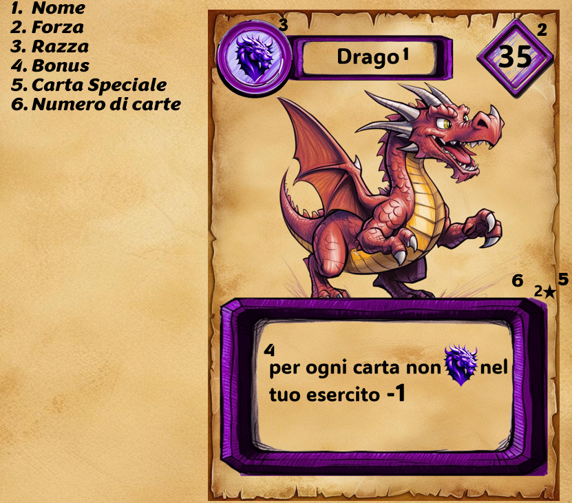
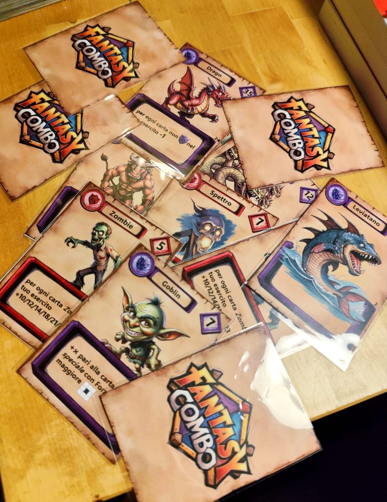
I had created all the cards for beta testing. Now we needed to test them and gradually fine-tune their balance.
The First Real Test: Changes and Solutions
There we were again, Leonardo and I. In the meantime, he had already started working on a practical way to playtest the game remotely. And what better tool than Tabletop Simulator, perfect for recreating board games from scratch in digital form?
So we created a custom mod for Tabletop Simulator and officially kicked off the beta testing phase.
As expected, this marked the start of an intensive process of revision and refinement. Many abilities were reworked or removed, especially those that interacted directly with other armies, as they risked slowing the game down and causing serious analysis paralysis. Our goal was clear: effects that were quick to understand, but never trivial. We didn’t want a “mindless” game, but we didn’t want a cumbersome one either.
We played many games, bringing in other playtesters to assess:
- how the game played at different player counts,
- the balance of the cards,
- and above all, the right number of copies of each character.
The Scoring Problem
From the very first playtests, a critical issue emerged:
- Counting the Points
Although the game was short, we realised that calculating the final scores could be more cumbersome than expected, especially for a game designed to be quick, intuitive, and light.
Of course, we weren’t talking about endless calculations… but if a game is designed to be fun and accessible, it should live up to that promise—right to the very end.
So we got straight to work. Leonardo took the lead in developing an app: a digital calculator for scoring the grids. Thanks to the game’s mathematical and structured nature, it was relatively straightforward to implement.
The result? An app that lets players calculate their scores in just a few seconds, without slowing down the game. A small addition, but one we hope will make a real difference for anyone looking for a smooth and rewarding experience.
The Presentation and the Start of the Final Project
The demo was finally ready. Now we needed to pitch it… and find a publisher willing to believe in it.
To bring our world to life, we needed an illustrator who could create a visually appealing and colourful style with a distinctive touch. We chose Francesco Musiani, an artist well known in both board games and role-playing games.
His vibrant, pop-inspired, wonderfully colourful style was exactly what we were looking for. And he didn’t hesitate for a second to join our adventure.
The Creative Process Begins
First, we needed to develop the lore: the story of our world, where our characters could come to life and add greater depth to the game.
We explored several ideas, but ultimately took inspiration from Francesco’s style.
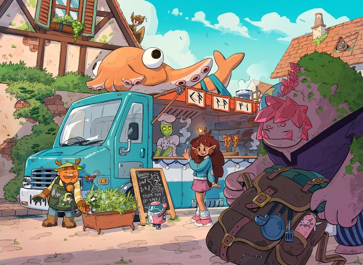
It was a setting we loved and felt could also appeal to a wide audience.
So I began writing not only the history of the world, but also the lore of the characters who inhabited it.
This is, in broad terms, the backdrop of the game.
“Welcome to Crystalvale. Year 1145 P.C. (Post Caelcryx)
About a thousand years ago, a strange comet struck the World, bringing death and destruction. Part of civilisation was swept away, leaving the “Chasm” in its wake. But the comet—known to the inhabitants of Crystalvale as Caelcryx, or the “Rift in the Heavens”—brought more than destruction. It also brought the Crystals: arcane formations that changed everything they touched—flora, fauna, the elements… even the flow of time. These Crystals were not merely matter, but pure energy vibrating to a precise rhythm: the Echoes. Those who came into contact with this energy gradually changed, becoming one with the Crystals. At first, this was thought to be merely an effect of the energy within them, but over time, the truth became clear: the Crystals respond to the soul. Every creature has its own “resonance”: a subtle wave that reflects emotions, choices, and intentions. When two or more beings are in deep harmony, the Crystals vibrate, and their energy manifests in extraordinary forms: healing, creation, knowledge, and transformation.
This phenomenon is also known as Harmony.
It cannot be controlled. It cannot be forced. It can only be listened to.
After centuries of chaos, a new era begins. Leaders from far and wide have stepped forward, embracing an ancient, forgotten principle: true strength lies not in domination, but in harmony.
Now it is your turn.
Guide the creatures of Crystalvale. Discover the resonance that unites you. Create synergies between different beings and awaken the Crystals, so that their Echoes may resound once more… and bring new life to Crystalvale.”
The defining inspiration came from Francesco’s illustrations. His colourful, richly detailed drawings inspired us to imagine a new setting: a post-apocalyptic yet gentle and profound world, populated by extraordinary creatures and landscapes brimming with mystical energy.
But we needed a purpose, a common thread to unite all these different creatures and explain why they worked together. And so the Echoes and Harmony were born: mysterious resonances released by the world’s Crystals, capable of producing incredible magic only when arranged with precision and harmony alongside the right creatures.
This vision gave the game its new name: Crystal Echoes. A title that sounded just right, instantly evoked the setting… and, surprisingly, hadn’t been used by anyone else yet.
Once we had settled on the theme and name, we immediately began working on the families’ new identities, giving each a distinct colour scheme to create a cohesive, recognisable palette. The four families became:
- Ironamber – yellow (replacing the Empire’s blue): mechanical or forged creatures with warm, metallic hearts.
- Rubyswarm – red (carrying on from Chaos): swarming, insectoid beings, organic and unstable.
- Shadyscales – blue (replacing the Beasts’ purple): shadow creatures, silent, reptilian, and stealthy.
- Greenshards – green (carrying on from the Sylvans): small, quirky nature spirits with unusual powers.
These families would provide the thematic and visual foundation for the game’s 31 characters, connected by style, race, and mechanics.
Some ideas had been ready for a while; others still needed exploring. That was when we began sketching the first characters: defining the visual style, the card layout, and finally choosing the font. It was a process of careful refinement, finding the right balance between readability, visual identity, and graphic consistency.
The First Decisions
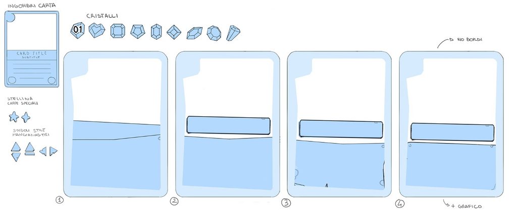
The first concrete step was to decide on the card layout. We liked the demo’s structure, which broadly followed established card game conventions. So we created two prototypes: one with borders and one without.
The bordered version was fairly traditional, but it didn’t immediately win us over: the borders tended to cover too much of the character artwork, whereas we wanted to give it as much prominence as possible.
For the crystal’s placement, we took some inspiration from the card layout in Lorcana, positioning the Echo points to the right of the character’s name to avoid “cluttering” the main artwork area.
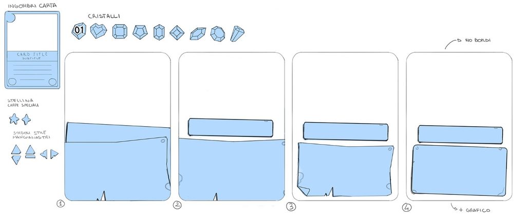
We wanted a light, charming, and informal layout, something that conveyed a playful, pop-inspired setting, far removed from the typical style of many fantasy card games.
So Francesco began drawing the first character sketches, not only to define the artistic style, but also to refine the cards’ final layout. It was essential to understand how the different elements—text, symbols, and artwork—would work together to create a harmonious overall look.
Bulbo was our first character: a charming little light bulb with a backpack and a love of travelling. We liked the wordplay on Bilbo Baggins from The Lord of the Rings, and he was also perfect for starting to build the “backdrop” of our world.
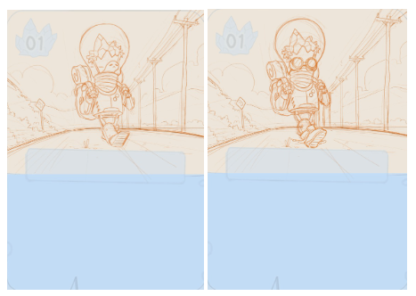
These were the sketches of our first character. We decided right away to incorporate a crystal into every character, giving the game’s lore even greater resonance.
We quickly realised that placing the Echo points in the top-left corner wasn’t practical. They weren’t essential information for the player, and they cluttered Francesco’s beautiful illustrations far too much.
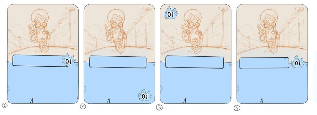
Of the different options, the fourth was our favourite. It was clean and well organised, with information clearly visible to the player without cluttering the artwork.
This became our first proper layout concept: a crystal displaying the creature’s base points, a box for the character’s name, and a sticky-note-style frame at the bottom for the creature’s ability text.
At this point, we could move on to new characters. First, we wanted to establish the setting, style, and colour palette of the different factions, both to guide Francesco and to help us create the characters who would populate the world of Crystal Echoes.
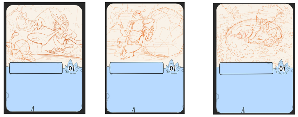
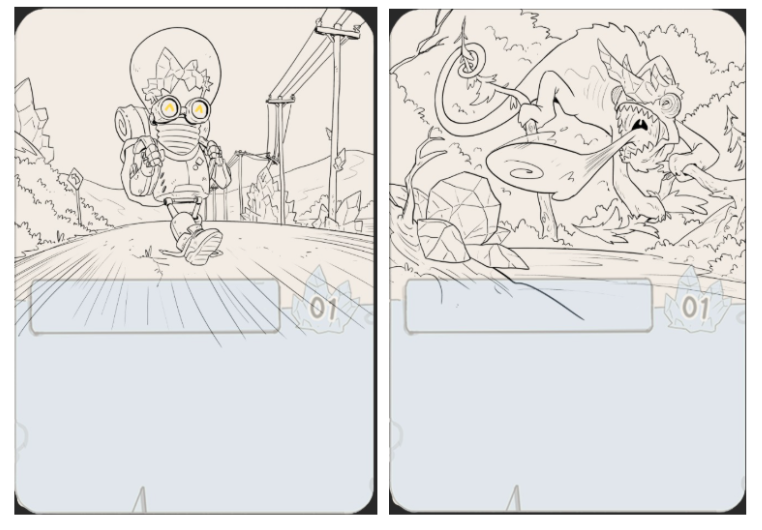
Next came Leon, Sterco, and Silvia, three more characters belonging to the families of Crystal Echoes.
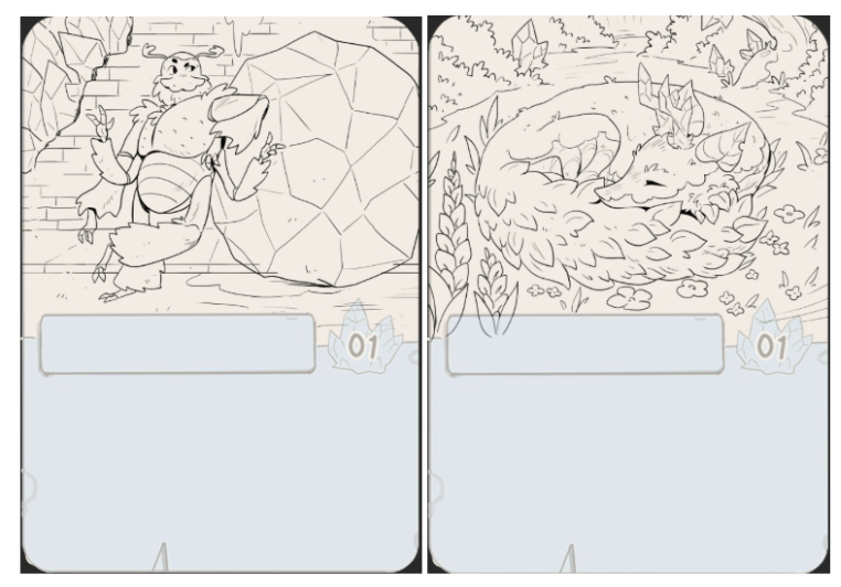
After the sketches and various adjustments and revisions, came the line art.
At this point, Francesco needed to work on the colours. As we had agreed earlier, each faction would have its own distinct colour:
- Rubyswarm: Red
- Greenshards: Green
- Shadyscales: Blue
- Ironamber: Yellow
These colours would form the basis of the colour palette for every card belonging to its respective faction.
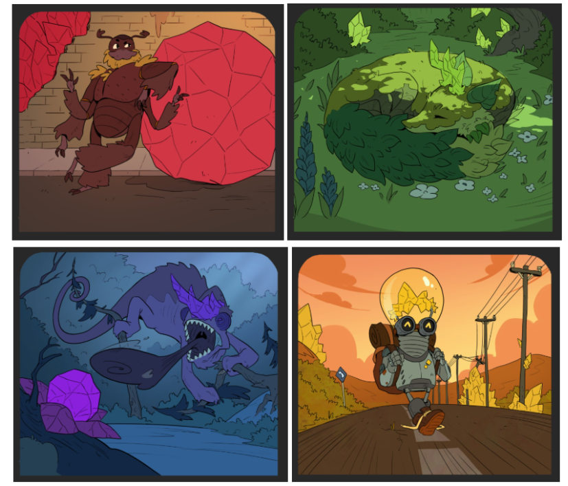
We were very pleased with Francesco’s flat colours, so we asked him to move straight on to the final colouring of our first four characters.
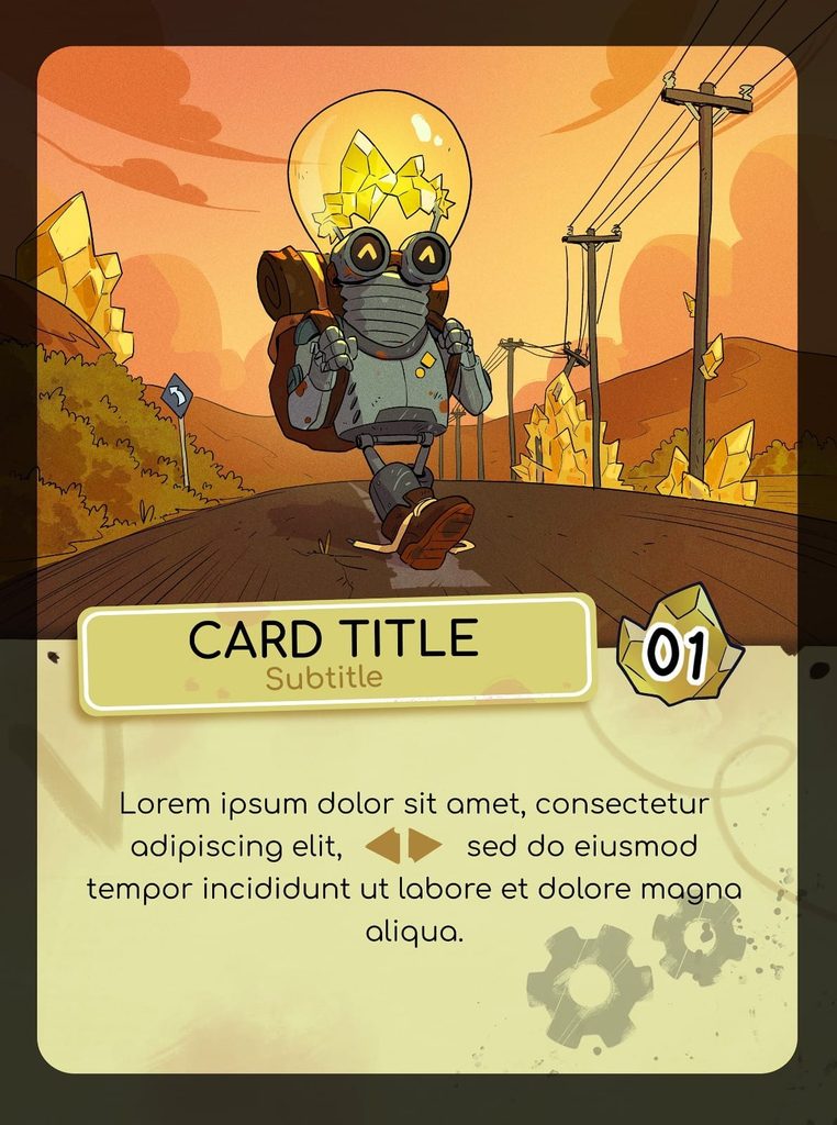
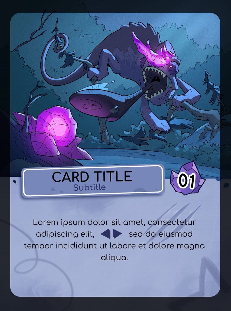
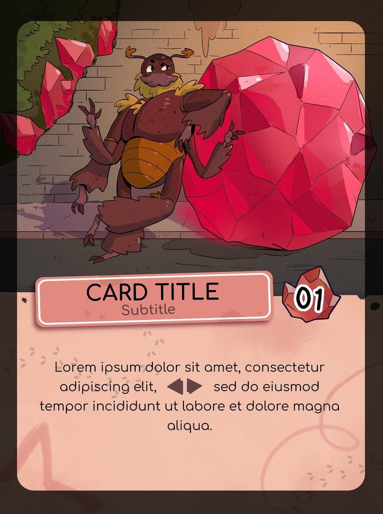
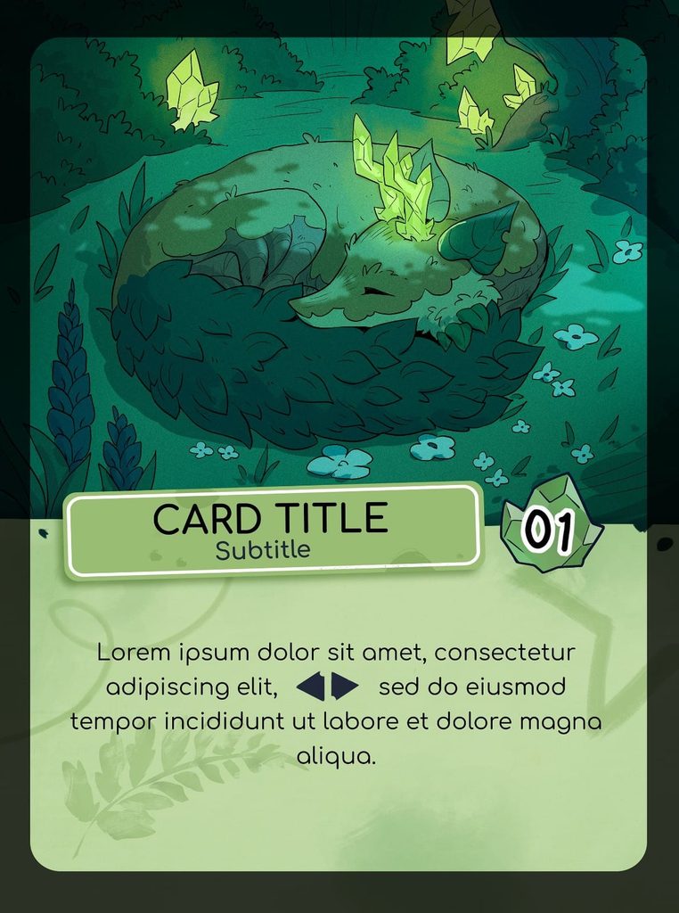
The first cards had been created!
Now we needed to choose the font for the cards and design the symbols, and it wasn’t going to be easy.
We also needed to gradually create all the remaining characters. You can explore the creative process, lore, and sketches for all the characters of Crystalvale here.
In this diary, we’ll continue exploring the more technical aspects of the game, particularly the box, the choice of font, and the game’s title.
The Game’s Name
We had chosen the name Crystal Echoes; now we needed to decide on its visual style.
We needed something simple and stylised that still evoked the game’s somewhat post-apocalyptic world.
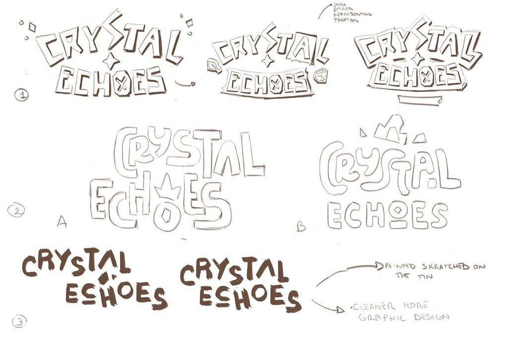
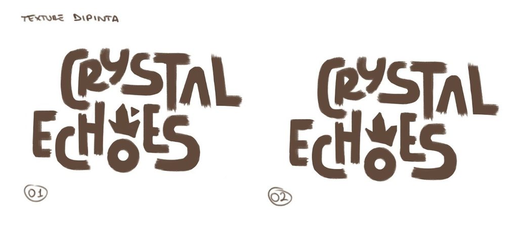
These were the first sketches, which also aimed to reflect the crystal theme, but they still didn’t quite convince us. We needed something more playful and simple. We decided to develop version 2 further:
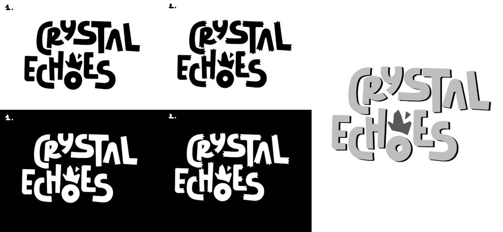
This was the final choice: version 1 or version 2. We felt version 1 was more complete and balanced, giving us the final design for the game’s title:
The Font and Card Symbols
At this point, we needed to choose one of the most important elements of a game: the font.
Choosing a font can be a real challenge if you’re not particularly familiar with graphic design. There are thousands, if not millions, of different fonts, many of them so similar they’re almost indistinguishable. But visual appeal matters, and choosing the right font can change not only the readability, but also the atmosphere and mood of the entire work.
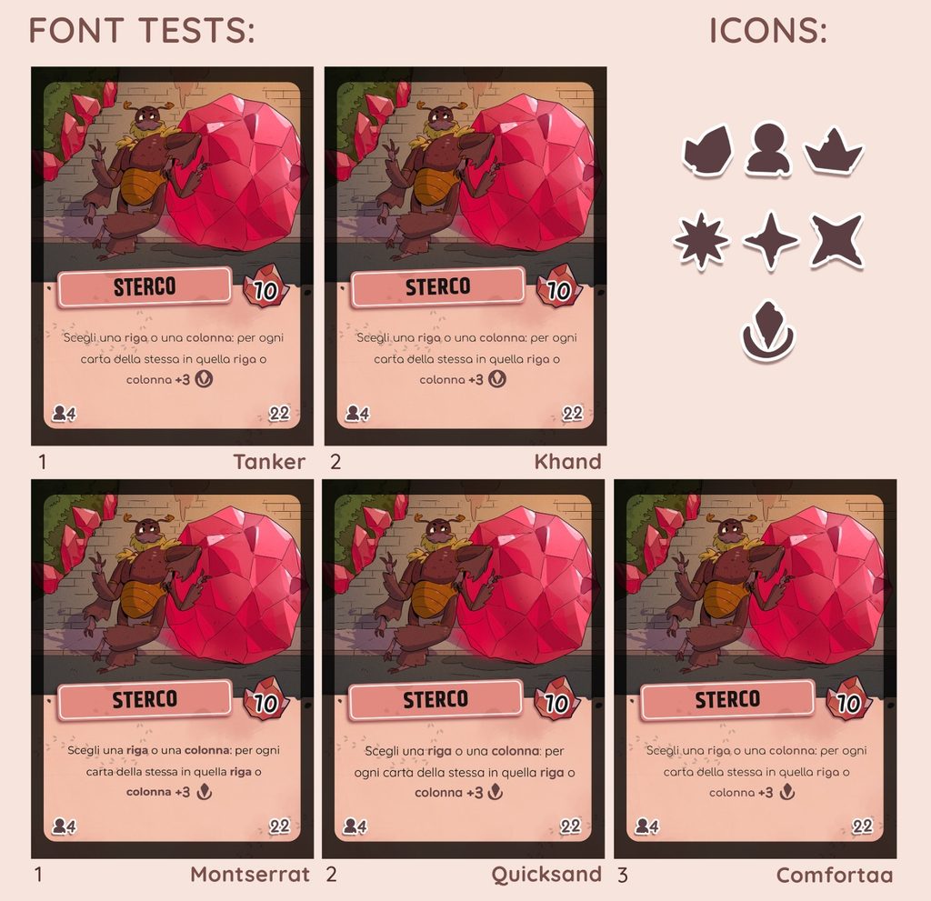
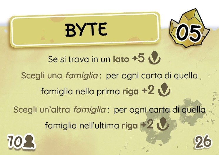
Choosing the font for the ability text was fairly straightforward, as was finding simple, easy-to-read icons.
Choosing the right bold font for the characters’ names proved more challenging. With the help of our graphic designer Lara, however, we found the right balance between readability and visual harmony.
The Card Back
Choosing the right illustration for the card backs was another crucial step in developing the game. Finding a style that was simple yet beautiful, while capturing the atmosphere and world of Crystal Echoes, was no easy task.
Initially, we opted for a torn, weathered paper effect.
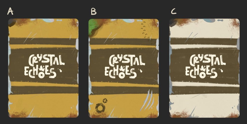
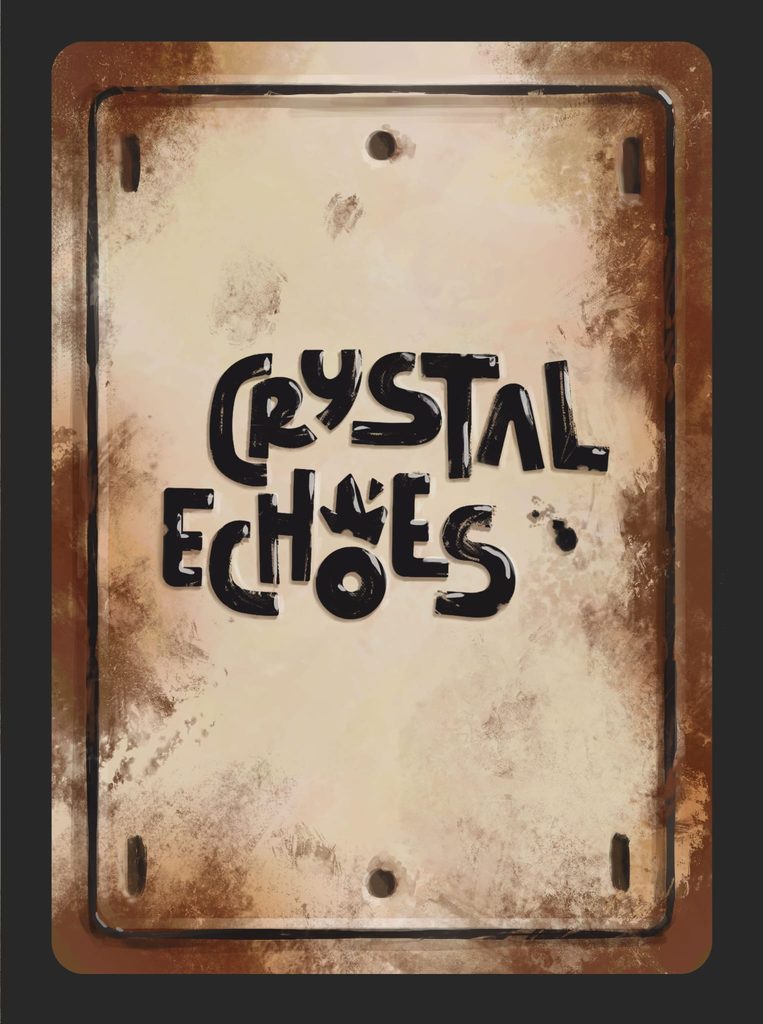
It didn’t quite convince us, so we switched to a design resembling a sheet of metal.
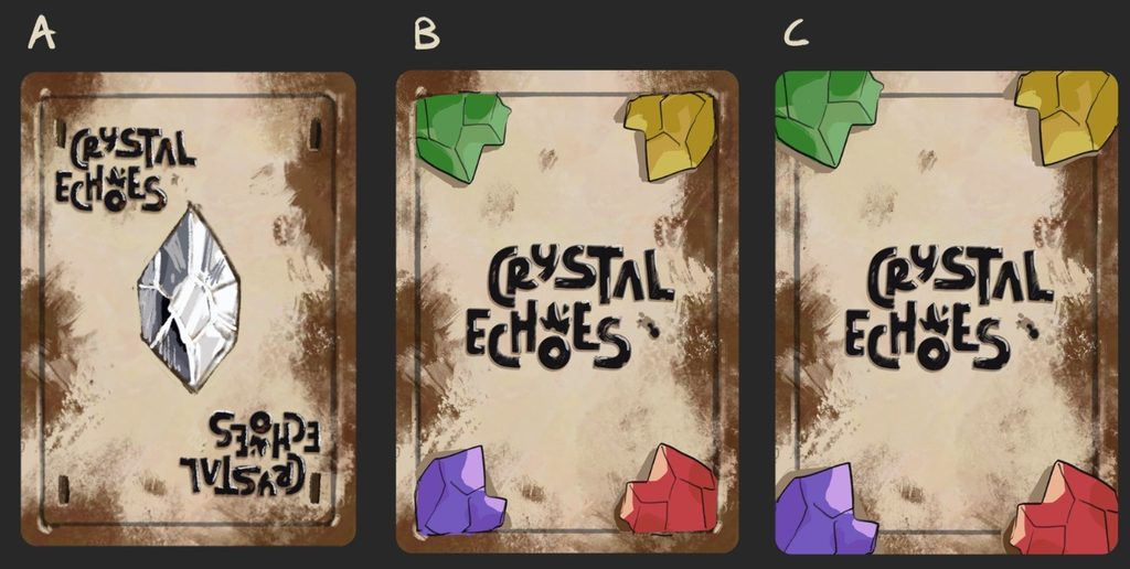
The initial options were more detailed, but we wanted something simpler and cleaner.
The Box
As a final step, only one thing remained: the box.
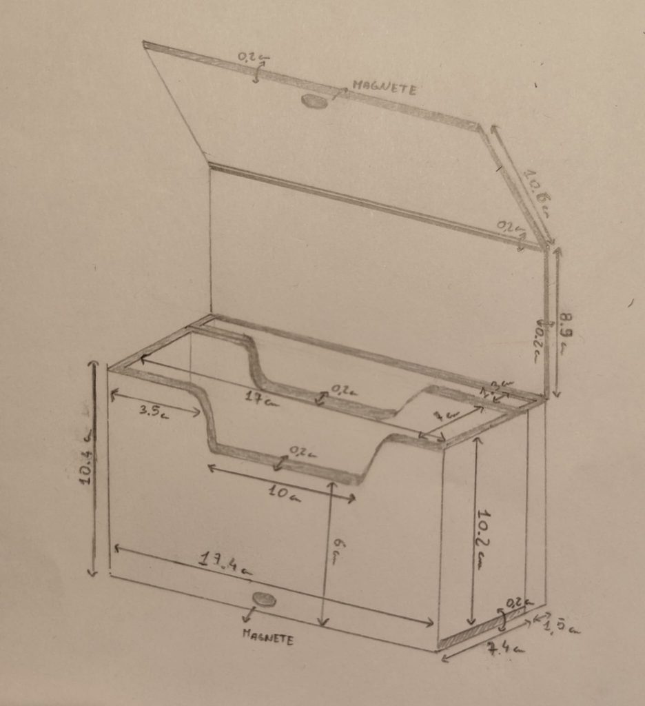
We settled on the box format almost immediately. We liked the idea of doing something different from traditional game boxes, and since our game consisted entirely of cards, a deck-box-style design was a perfect fit. With between 200 and 240 cards in total, we needed plenty of space, so for convenience we opted for a wide format rather than a long one.
It would also have a magnetic closure and open from the top.
For convenience, we also added an internal divider to create two compartments: one for the cards and one for the rulebook.
This was the first draft of the Crystal Echoes box.
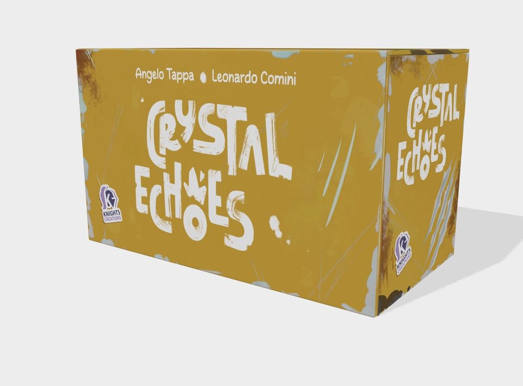
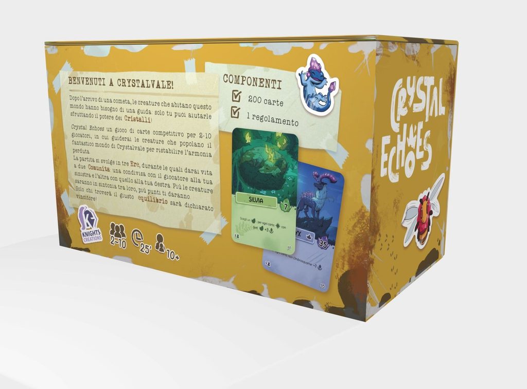
Next, we needed to illustrate it and make it unique. At Francesco’s suggestion, we opted for a diegetic box, designed to look like an object straight out of Crystalvale.
The final result looked something like this:
Conclusion
Today, Crystal Echoes has taken shape, with its own identity and a clear direction. But this isn’t the finish line. It’s a solid foundation to build on. There’s still plenty of work ahead: playtesting, refinement, balancing, difficult choices, and inevitable compromises. It’s all part of the process.
At the same time, this world still has many stories to tell. New ideas, new characters, and new surprises are already taking shape. Here you’ll find all the links to the Crystal Echoes pages. You can also follow the project on Gamefound!

